[51 case studies]Multilingual website design comparison summary
release 2018.08.26 update 2024.3.27
There are many differences between international and Japanese website design.
In order for foreign customers to easily understand the products and services of small and medium-sized enterprises (SMEs),
it is necessary to
“be aware of these differences” and
“be creative in expressing and reflecting these differences in a way that is understandable to international customers”.
“Re-express and reflect these differences in a way that foreign customers can understand”. “Re-expressing the angle” does not just mean translating from Japanese to English. Cross-cultural adaptation is necessary along with appropriate web design expression.
Cross-cultural adaptability is difficult to acquire in a short period of time, but it is an essential skill for successful international expansion.
As a first step, it is a good idea to start by ‘becoming aware’ of the differences between Japanese and multilingual web design requirements.
A collection of multilingual web design gallery sites can be a useful reference. This is a completely arbitrary commentary, but we have created a comparison of international and Japanese web design 51 case studies in the hope that it will help you become aware of the differences.
We hope that this comparison will help small and medium-sized enterprises aiming for international expansion to awaken their sense of international web design and switch on their cross-cultural adaptability.
Characteristics of international and Japanese web design
The characteristics of international websites include
- Logical simplicity that makes it impossible for people from any position, with any level of education, in any part of the world to make any mistakes when reading it
- Narrowly focused information
- Navigation, icons, and flow lines are only essential
- The layout is clearly laid out in small, medium and large areas so that the reader does not have to think about how to move around and what to look for
- Deliberate use of margins and white space
- Aimed use of images and photographs that stimulate the imagination
- The ability of the design to communicate instantly.
- Most of the main messages are ‘benefits for the other party’, and a marketing perspective on how it is seen and how it should be seen is deployed throughout.
- Replacing company and product names with those of other companies in the same industry makes the company look less like a ‘X’ company and less coherent.
- The company itself communicates the advantages of its products. The idea of using celebrities is rare (in Europe and the US).
The characteristics of Japanese websites include
- Lots of information, detailed layout, multi-colored, lots of photos.
- There is a tendency to include everything you want to say, out of a fear that ‘if you narrow down the information by making a clear cut and narrowing down the information, the frontage will become narrower’.
- Tendency to underestimate the importance of marginal space and lingering words as part of the strategy to create a feeling amongst visitors, leading to a call to action.
- The corporate attitude of being serious, busy and hard-working is conveyed, but it is difficult to understand what benefits this brings to visitors.
- Content that can be used to some extent even if the company name and product name are replaced by the names of other companies in the same industry, content with few special features.
- Content with many general messages and which highlights the company’s color, such as “This is a XX company”! There is little that makes the company’s colors stand out.
- There is still a sense that the homepage is an electronic version of the company brochure or product catalogue.
- Large Japanese companies often use celebrities in their advertisements, and visitors do not feel particularly uncomfortable with a smiling celebrity on the top page.
There are a number of reasons for this.
(One note of caution, however.)
Japanese corporate websites are, as a precondition, designed for the Japanese market. As long as Japanese people browse them, there is no particular problem. However, if such an ordinary Japanese company starts to think that it also wants to expand into international markets, the story changes.
It is a ‘no’ if the same content can be translated only in different languages, so it is necessary to understand and take into account the differences in the way the website design appeals.
Many of the evaluations described below praise international websites, but this is from the perspective that they are easy to understand and easy to take action from the perspective of international users, and not necessarily the same from the perspective of Japanese users.
The correct answer depends on who the target audience is.
Let’s take a closer look!
Overseas vs Japanese Website Design [Comparison of the same industry, international and Japanese, and how to attract people].
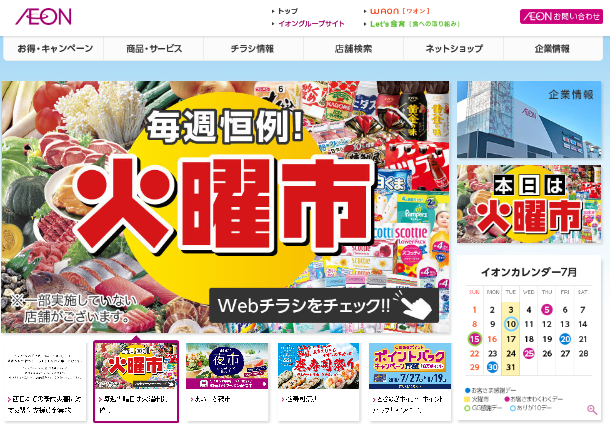
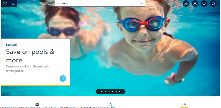
Major retailers Aeon vs Wal-Mart (USA)
Aeon’s TOP page is all about things(Products), while Wal-Mart’s TOP page is all about things(Experiences).
This is what the website of Wal-Mart, a discount supermarket, is all about! This TOP page conveys the fun of summer holidays.
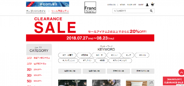
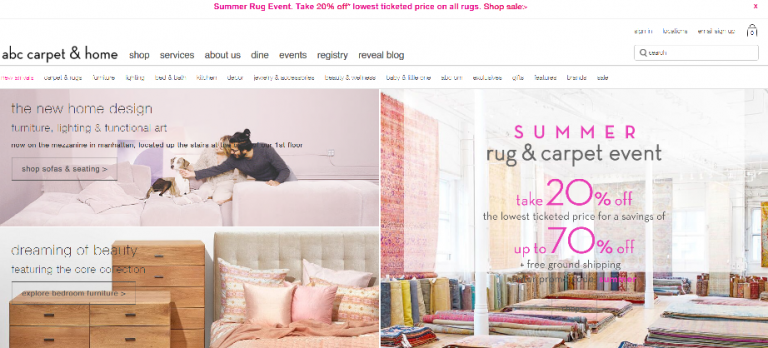
Interior goods shop Franc Franc vs ABC Carpet & Home (USA)
enchanting and beautiful colors even during the sale.
Both companies are stylish in their actual shops, but what makes you want to shop online without a second thought?
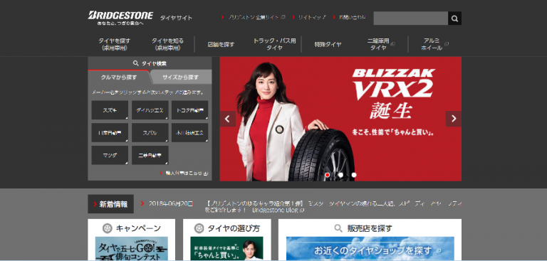
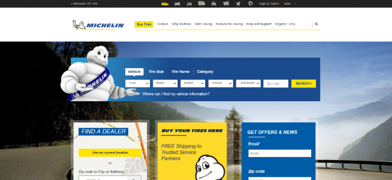
Tire manufacturer Bridgestone vs Michelin (France)
Celebrities often appear in advertisements for large Japanese companies. This is not strange for Japanese people, but it can be strange in other countries. Both companies try to keep their TOP pages simple, but Michelin is simpler.
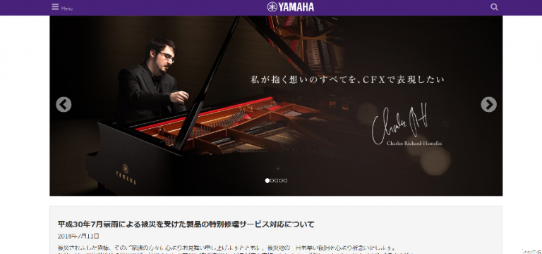
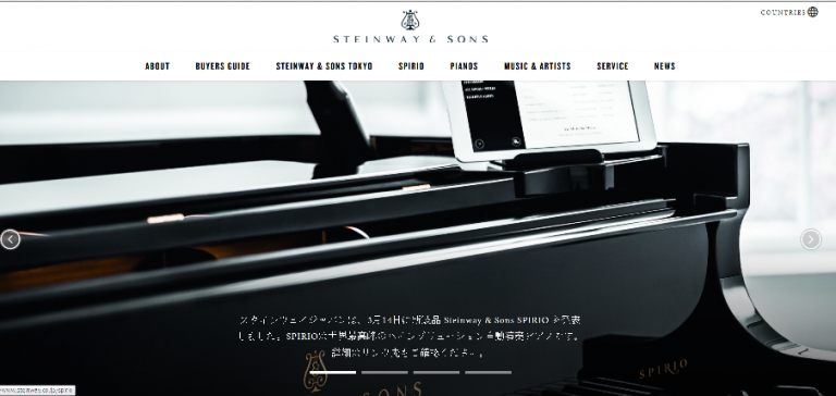
Piano manufacturer Yamaha vs Steinway & Sons (USA)
Pianos are definitely the star of the show for both companies, but we feel more confident in the way Stanway’s pianos are presented.
The production site movie and the well-thought-out Stanway logo font are also appealing.
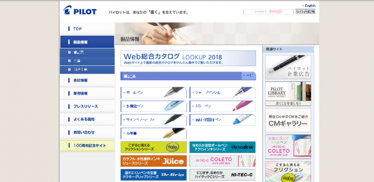
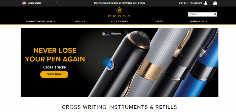
Pen makers Pilot vs Cross (USA)
Pilot is a great company that invented the Fraxion pen, but in terms of how they present their products on the web, Cross has the advantage with their high-quality photos.
Pilot has a gallery on its 100th anniversary site, where posters and advertisements from the past 100 years are arranged by year, which is spectacular, but there is no explanation of each one, which is a real waste of a treasure, as international enthusiasts would want to know and read about the background of the products and advertisements of the time.
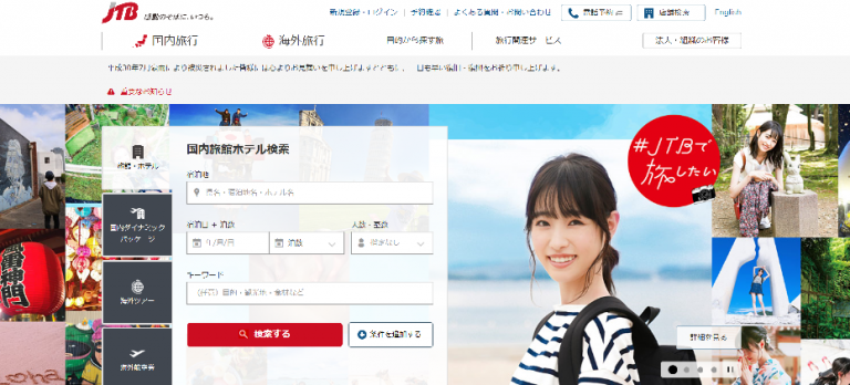
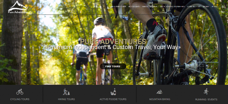
Travel agent JTB vs Pure Adventures (USA)
If you want to convey the message through the facial expressions of the people, use more close-up shots,
If you want to emphasize a scene, you may need to use a specific scene angle to bring out the emotion, rather than a photo of XX sightseeing spot.
On the other hand, Pure Adventures’ site, is very good. In terms of people, you can only see their backs and soles of their feet, but you can almost hear the sound of cycling in the forest from the scenes, and the anticipation of what you might find on your trip is heightened.
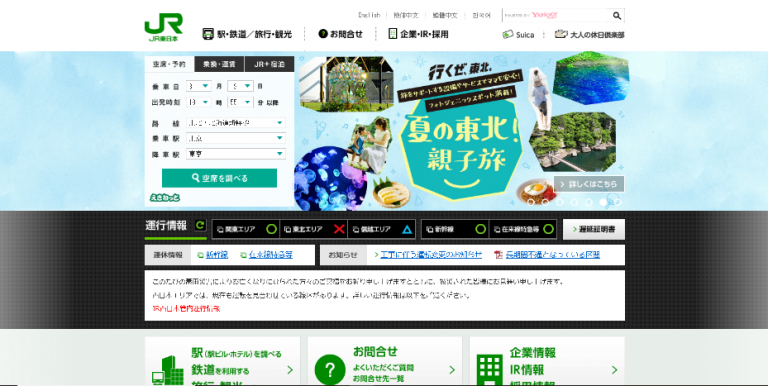
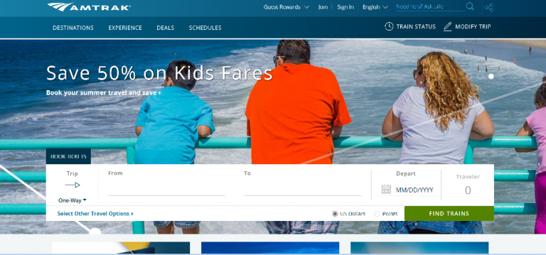
Rail company JR East vs Amtrak (USA)
Amtrak’s message is ‘Half price for children’, a summer scene with a family leaning out on the beach, a destination search window, and that’s it. JR East, on the other hand, has Tokyo Olympics 2020 on the first page.
And when I wander around, there are seven in the carousel, including Management Vision Transformation 2027, Otaru Hakodate Furano together as Hokkaido, PR, and so on.
I was going to write that this was ‘too busy’, but then I looked at the English website to make sure, and there were 12 more than that! are on ・・・・ I was afraid.
I wonder if they were told to include everything for inbound foreign tourists.
The LIVE JAPAN, TORETABI JAPAN and SHIKISHIMA brand sites were great on the big screen, and each was very cool in its own way!
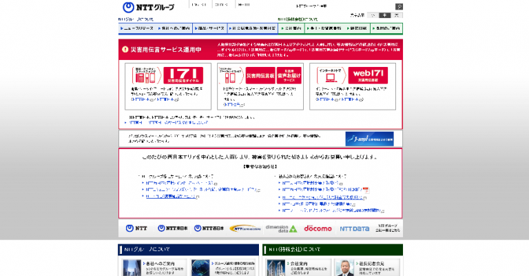
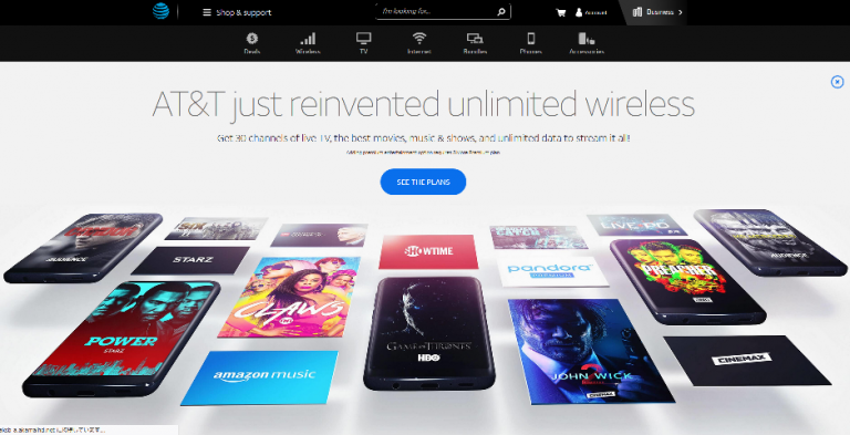
Telecommunications companies NTT vs AT&T (USA)
NTT’s site was so unassuming that I wondered if they had a real official site elsewhere, and then searched again. It has something in common with Yahoo (see below), but the common denominator is that the font size is “too fragile”.
On the other hand, the English and Chinese sites have darker, clearer and clearer characters! (Why only the Japanese font?) AT&T, as the largest telecommunications company in the US, has a general design with one message per scene that is easy to read and understand.
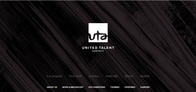
Talent agency Smile Up vs United Talent? (USA)
The equivalent of the Japanese Smile Up(former Johnny’s)an entertainment agency of the same concept, was not found in the US.
The entertainment industry? The system of the entertainment industry is quite different between Japan and the US, so a simple comparison cannot be made, but it would be a comparison of a company that displays a slider with many talents on the TOP page vs. a company that does not show pictures of talents with an agent contract.
UTA is one of the world’s largest Agents based in New York, with A. Jolie, J. Depp, C. Dion and others.
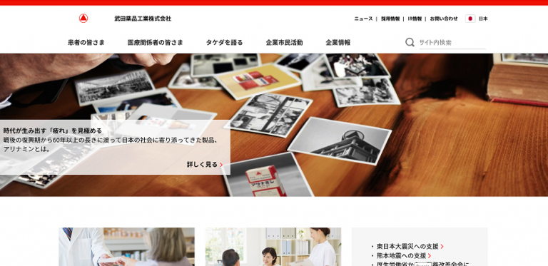
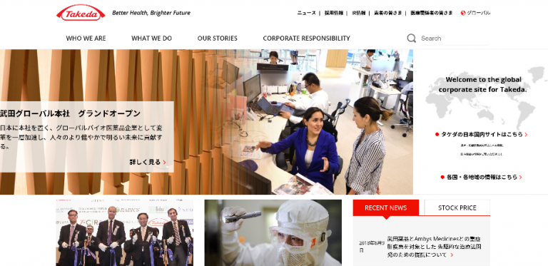
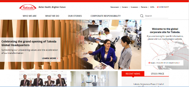
Pharmaceutical companies Takeda vs Roche (Switzerland)
Takeda’s website is an odd one for a Japanese company. It has a Japanese version for the
Japanese domestic market and Japanese and English versions for the global site, and is very good in that it does not intentionally globalize the Japanese domestic site.
The Japanese site is also well organized and easy to read. Roche is indeed the world’s number one pharmaceutical company. From the top, the site is full of documentary movies that you wouldn’t expect from a pharmaceutical company. What kind of interview is next?
Domestic website
Global site Japanese version
Global site English version
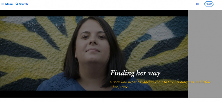
Roche
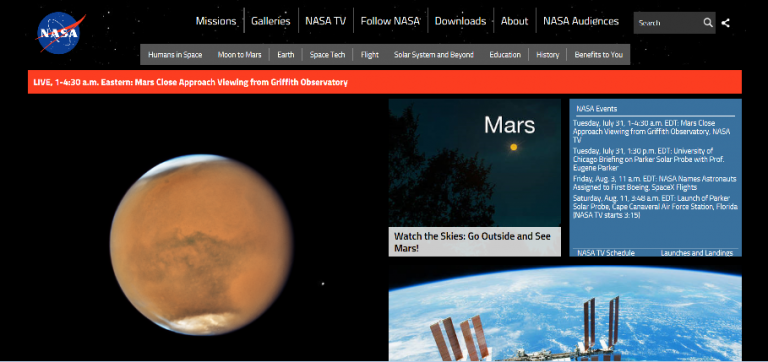
Space development JAXA vs NASA
Looking at JAXA as a stand-alone site, the content is sufficient, but when the NASA site is read in, the content quality and quantity are both exceptional.
Even at the top of the site, NASA’s tabs are clearly titled: Humans in Space, Moon to Mars, Earth, Space Tech, Flight, … and finally Benefits to You.
You can even get to the space video movie page without looking for it, And the quality of the images is impressive.
The JAXA also has a very comprehensive list of project genealogy, which is very impressive and very easy to understand.

Government ministries Japanese Ministry of Defense Self-Defense Force vs US Department of Defense
Another feature of the domestic site is that many of the photos are “front-facing”.
On the other hand, the US Department of Defense site has a clear strength and weakness, with large photos at the top of the page so that you can immediately click on the item you want to know about, while the rest of the site has to be scrolled down to read it.
Both our country and the US seem to be putting a lot of effort into recruiting, but what kind of feelings do they want to arouse in visitors?
The difference can be seen by reading through both websites.


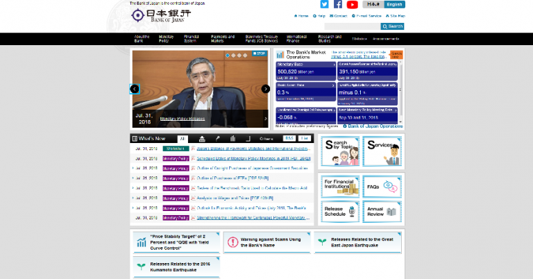
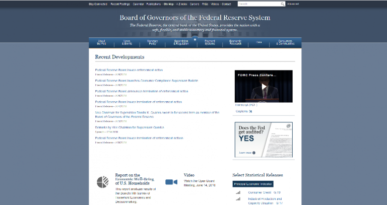
Central banks Bank of Japan vs. FRB (US)
Both have mainly small text, but the FRB is easier to read with less color.
You can also distinguish between the two as having cartoon illustrations in Japan and illustration icons or infographics in the US.
Although this is a little off the subject of web comparisons, the no-necktie, cool biz (expressive appearance) may be more difficult for Japanese who are not physically built up.
Sorry, The 31st Governor Mr. K.
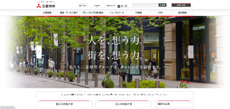
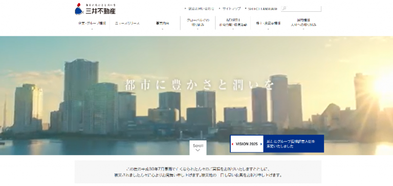
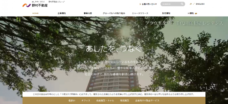
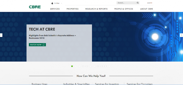
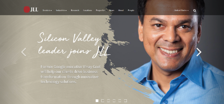
Real estate service companies Mitsubishi Estate, Mitsui Fudosan and Nomura Real Estate vs CBRE, JLL, Cushman & Wakefield
I was somewhat surprised by the websites of the three major Japanese real estate companies.
They are very similar.
The overall layout, the pull-out photos of cityscapes on the TOP page, the white centered text, the title “Global Initiatives” in the main navigation, and the absence of the “unique features of a real estate company” in the catchphrase.
For example, it would not feel particularly strange if the message of Mitsubishi Estate were replaced by the respective messages of Nomura Real Estate and Mitsui Fudosan. (They fit in well).
On the other hand, the three major real estate companies in the United States have so many different characteristics (especially JLL!) that when the catch copy is replaced, the content of each company’s message is not consistent with the others.
Three US companies from here.

Overseas vs Japanese Website Design [Five examples of cross-cultural adaptation and fascination of Japanese companies]
The following is a comparison of one company’s Japanese head office website with a local website, or a Japanese website with an English website.
To make it easier to understand, we have collected only very different versions. Except for Japan Post Bank, these sites are good examples of successful cross-cultural adaptation.
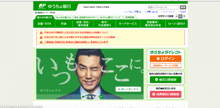
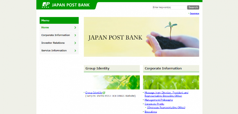
Japan Post Bank
Although the site is in English, the green corporate color and the atmosphere (?) have been taken over.
The top photo is a close-up of a sprout and a palm, which is not related to Japan Post Bank, and the soil can be seen, which may be misunderstood as an investment in agribusiness.
The picture may be misinterpreted as an investment in agribusiness as the soil is visible.
The image is not deeply meaningful, but is supposed to be an image of “We will protect your valuable assets, let’s grow them together”, but such an “extended interpretation” is not likely to be expected from first-time visitors or international customers who do not know anything about Japan Post Bank.
(However, this kind of image is very, very common among Japanese companies, who are aware that they should be able to share the same image with their customers.)
The asymmetry in the amount of information on the Japanese and English websites is also a concern.
(There are many Japanese companies that have translated some of the information on their websites into English, as if to add to it.)
If the volume of information on the English site is quite small, visitors to the English site will be discouraged. By all means, try to provide the same volume of information.
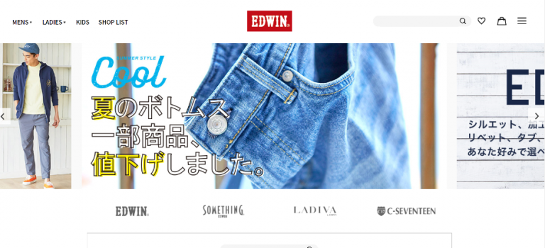
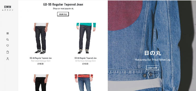
Edwin
The Japanese, European and US sites are all aimed at a local target audience, with a clear intention.
It’s great, very good, with ‘big’ clarity!
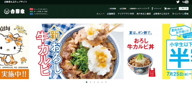
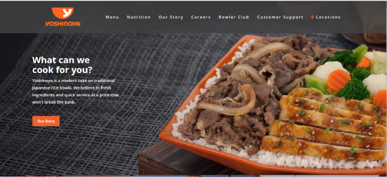
Yoshinoya
Yoshinoya also has a completely different website from its head office in Japan and the US site.
Both sites are clean, but the US site is even leaner and the use of color is more focused, making it very easy to read.
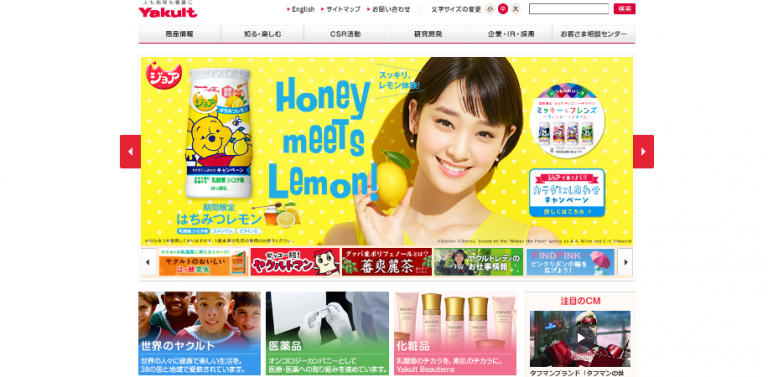
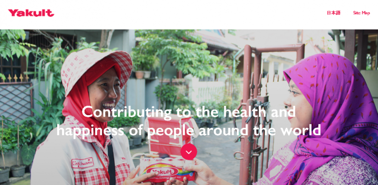
Yakult
This is a comparison of the Japanese site and the global site. How many colors are there on the TOP page of the Japanese site? The global site is a single scene with a single message. Compared to the domestic sales volume, Yakult is selling more than 5 million bottles/day in Indonesia.
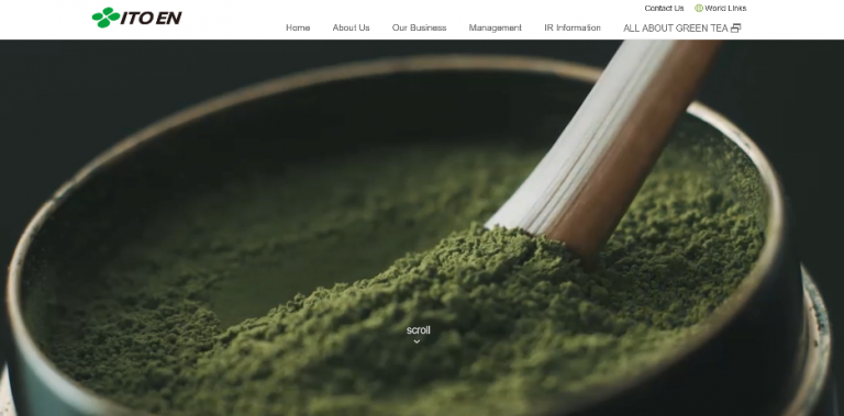
Ito En.
This also features celebrities on its Japanese website.
On the global site, matcha is used throughout, and even the bottled tea that comes out later has a beautiful image of matcha, matcha in full bloom.

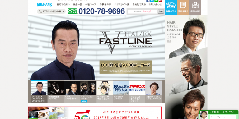
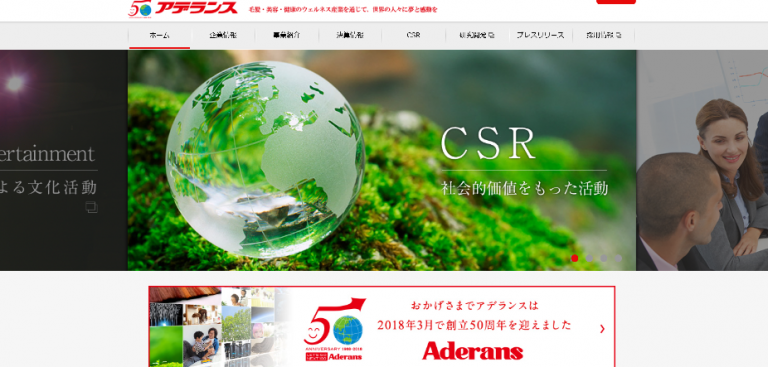
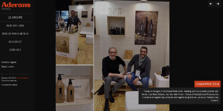
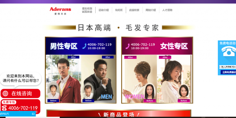
Aderans
I didn’t know there was a Japanese corporate website with such a local fit!
It’s really amazing!
It is a super example of localization with a complete focus on the local target.
From here, there are five consecutive sites: a domestic men’s site, a domestic corporate site, a French, Chinese and Hong Kong site.

Overseas vs Japanese Website Design [Six examples of successful localization of foreign companies to the Japanese market]
The following are six examples of successful localization for the Japanese market by foreign-affiliated companies.
The Japanese sites are listed above and the home (international) sites below. It is a bit complicated,
If you, as a Japanese, feel no sense of discomfort when looking at the top site, it means that the localization of the foreign company to the Japanese market has been successful.
On the other hand, if you are overwhelmed by the design of the site below (the home country site) and feel excited and wish you could have read the Japanese version of this site, then this may be a case of failed localization for the Japanese market.
It may be a case of failed localization for the Japanese market. For those new to international expansion, the website below (the website of the foreign company’s home country) may seem too simple, and you may feel that a Japanese website with more information would be “somehow more relaxing and easier to understand”.
On the other hand, visitors to the home country site of a foreign-affiliated company may feel that the lower site is “somehow more relaxing and easier to understand” than the upper site (ignoring language differences).
What is your own feeling of discomfort in this area, and why do you feel uncomfortable on this site? It is also a great way to develop your cross-cultural adaptability.
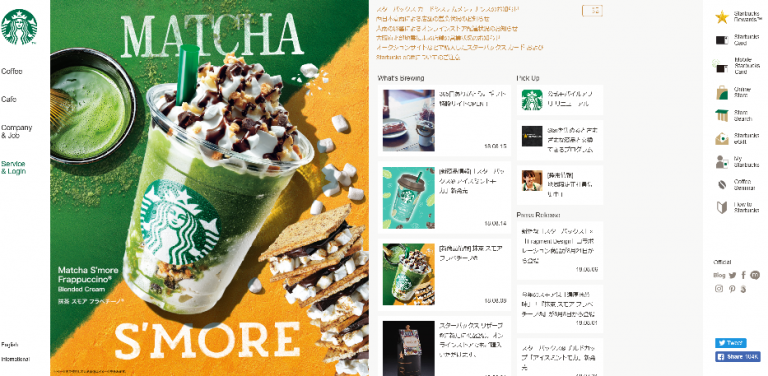
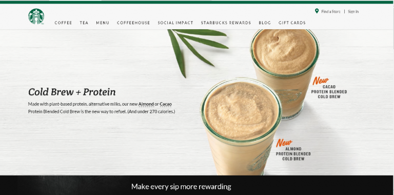
スターバックス日本 VS(米国)
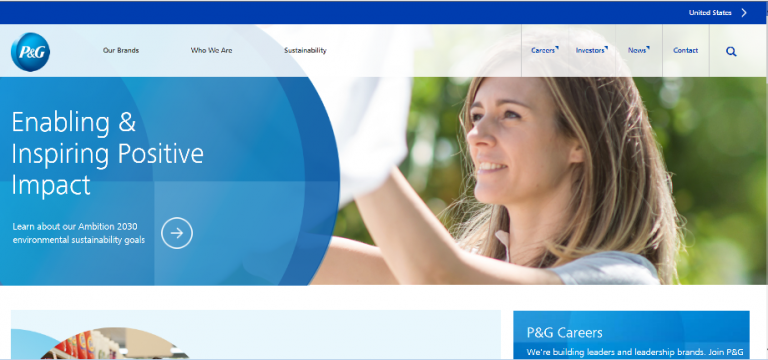
P&G Japan vs. P&G USA

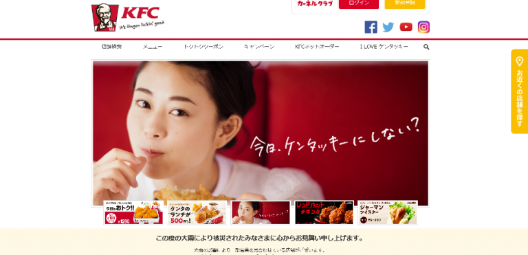
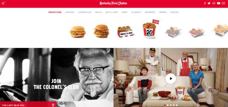
KFC Japan vs. KFC USA
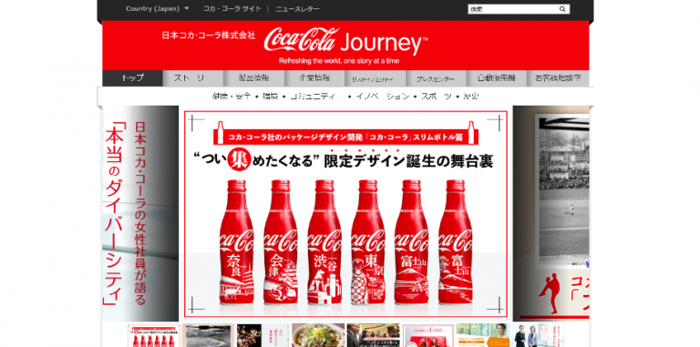
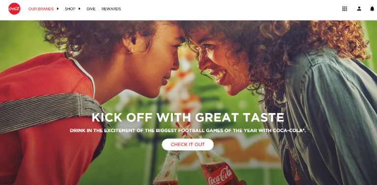
Coca-Cola Japan vs Coca-Cola USA
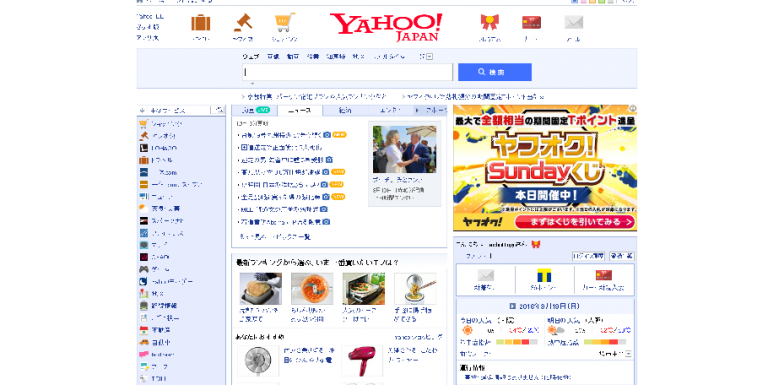
Yahoo Japan vs Yahoo USA

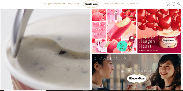
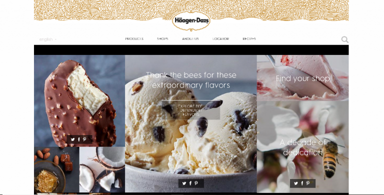
Haagen-Dazs Japan vs Haagen-Dazs US
The photos on the Haagen-Dazs US site are particularly outstanding. It is packed with know-how on how to make food look tasty and appealing.
Overseas vs Japanese website design [[7 successful examples of Japanese companies’ overseas subsidiary websites with global specifications].
Finally, here are seven examples of websites that were created with global specifications from the outset, without being overly biased towards either country.
In the case of a Japanese company, the head office site was designed with globalization in mind, avoiding a purely Japanese look and feel, and the content is presented in a style that would not look out of place if translated directly into English.
In the case of foreign companies, on the contrary, fine-tuning of localization to Japan can be seen everywhere.
EIZO
Japanese site, global site, French site, US site. Almost identical quality. However, the fine-tuning is excellent and not uniform, perhaps due to local initiative.
The instruction manuals are also displayed in six languages and five countries from the start. I forget which country EIZO is from, is it really a Japanese company?
And if I’m not careful, I almost say ‘Ishikawa Prefecture Country’. It’s a cool company!
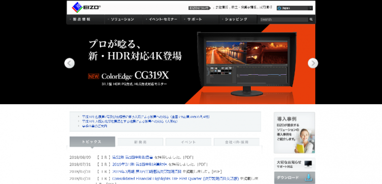
Japanese site
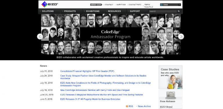
Global site

France site

US site
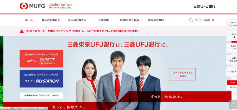
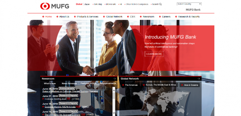
MUFG Bank, Ltd.
The design of the Japanese and global sites are different, but the tone is indeed kept homogeneous.
As an aside, on the global site, the name of the chairman of the board was Mike.
I thought, “I see, he is a foreign CEO, Mr. Mike whatsit – but he is Japanese, Mi-ke-san.
I thought that Mi-ke-san must have been mistaken for Mr. Mike when he was in the US, as no one in the US would have imagined that the name Mi-ke was written and read as Mike, although this is irrelevant.
This is the website of the Industrial and Commercial Bank of China, a major Chinese bank.
It has the same corporate color red, icon (circular) and abbreviation of four letters of the alphabet as the Bank of Mitsubishi UFJ, but they have similar but different images.
The differences are made by the different support colors of blue and orange, the amount of red and the lack of people (China).

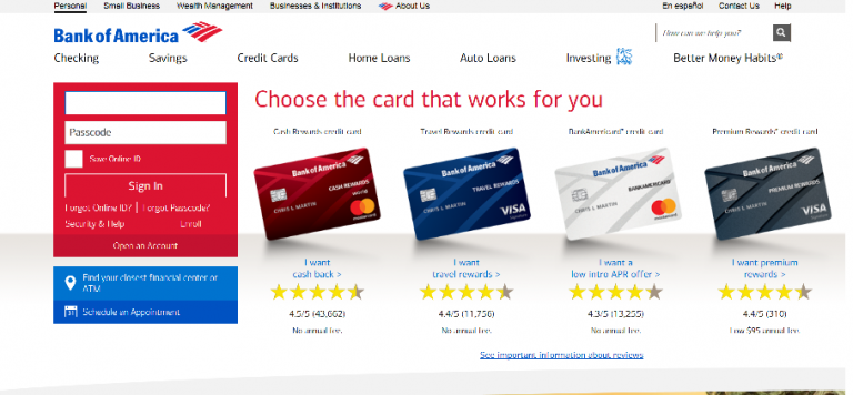
This is a major US bank, (1), Bank of America.
This is a campaign that major Japanese banks are unlikely to run, such as a 20,000 yen (converted to 100 yen to the dollar) cash-back campaign for card enrolment.
But it is on the TOP page, probably because this is the one that resonates the most.
This is JP Morgan Chase & Co, a major US bank (2), bank holding company and investment bank.

It is clear that Mr. James Dimon (Chairman and CEO of JP Morgan) on the top page and the aforementioned Governor of Japan’s central bank have different ways of presenting themselves and what kind of image they want to give not only to those who know them, but also to those who don’t know them at all.
This difference can also provide hints for the international expansion of Japanese small and medium-sized enterprises (SMEs).
The photos on the Morgan page were taken by a dedicated stylist on the day of the shoot, so it may be no surprise that the photos make a good impression.
How does this compare with the BOJ Governor’s grey hair, no tie and ordinary business suits (probably his own) mentioned earlier?

The message and the photograph almost create an image of the person.
Even if the true image of the person is quite different, a pleasant, spare, blood-colored appearance is an element of trust.
Only when people trust you can you get your message across. In international business, it is almost never acceptable to think that appearance is secondary to substance, so you need to be constantly aware of how you want to appear to others and how you want to attract them, and be proactive in creating an environment that facilitates smooth business.
NN Life Insurance
The following is a message from the President (Mr Frank Eysink) on the company’s website.
“We would like to thank you all for your continued support and patronage of NN Life Insurance. … I would like to thank you for your continued support and patronage.”
This is a very Japanese version. (In the original text, there is no such thing as “your patronage” or “best regards”.)
The signature sign at the end of the greeting is unique only (click here↓).

(This kind of signature is also common in other countries, but in Japan it is not so common…) This gap is a proof of cross-cultural adaptation, and is very nice.
When we checked in 2023, the president had changed and the above sign was no longer on the website…
It can be said to be the result of the trial and error of a foreign company that has been working on the development of the Japanese market for many years.
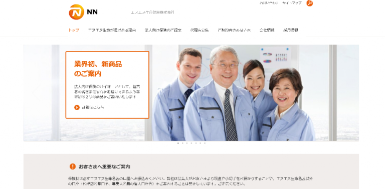
The top photo of the president (presumably a man) smiling with his employees in work clothes is a typical image of Japanese small and medium-sized enterprises.
Who is the message aimed at? The message is clear and to the point.
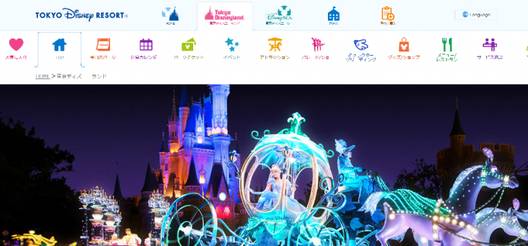
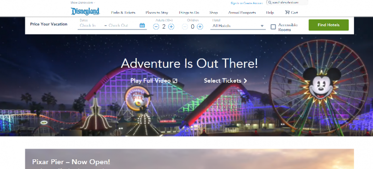
Disneyland
A few years ago, the Japanese Disneyland site and the home country site were quite different in terms of presentation.
The Japanese site was more focused on the characters (Japan) and the home country site was more focused on the happy faces of the Guests (home country).
This time, when we looked into it, both websites were as close as they could get to the same image, both countries agreed to give the night parade the highest PR priority !
How to reflect international website design on your own website
How was it?
By comparing and contrasting the website designs of international and Japanese companies, you may have been able to appreciate not only the cool appeal of international designers’ web designs, but also the unique Japanese appeal methods that you may not have noticed before.
The culture and business practices of each country are clearly expressed in web design, but there are many aspects that differ between Japan and other countries, so depending on the product or service, it may be a solution to leave the Japanese site with too much information and produce a website with a different site map and web design for international markets in mind. This can be a solution for some products and services.
On the other hand, only some pages may need to be changed for an international audience, or the content may be the same both in Japan and internationally.
This is a case-by-case basis, as each company has its own products and services and how it wants to expand internationally.
The way to reflect international website design on your own website is to first check international competitors’ websites, identify the top-ranking international competitor’s website design in the country, and adapt your own website accordingly.
However, for niche products and services with a small market, there are few competitors to benchmark against, so it is not possible to make trial-and-error attempts to meet the needs of potential customers.
The first step is to test a hypothesis about what kind of web design and content potential customers want.
In this issue, we have featured many web designs for B2C products of large companies.
B2C products are directly linked to sales if they are properly localized for international markets, so they require a large investment and have a large impact as a subject for comparison on the theme of cross-cultural adaptation.
On the other hand, in B2B (production goods and other goods for which companies are the customers), compared to B2C, even if the product is not properly cross-culturally adapted, if there are size descriptions, test methods, international standards and material labels that are accepted overseas (in other words, if the specifications that can be compared are known), it will be clear whether or not to contact the company,
Even if web design localization (cross-cultural adaptation) does not score full marks, the damage is not that great.
However, it is difficult to increase the number of enquiries from overseas simply by translating a Japanese website, so the cooperation of a website design company that understands international web design is essential.
Your company’s website will attract a lot of foreign customers as you have imagined, and the overseas market will say, “You know what you’re doing, this company knows what it’s doing!
We wish you the best of luck with your global website design.
Paccloa Co., Ltd. can help you prepare an RFP (Request for Proposal) before contacting a multilingual website production company, introduce the most suitable website production company for your company, and support the production of sales promotion tools (English presentation materials, various English templates, etc.) necessary for international expansion,
The company also accompanies overseas exhibitions, accompanies overseas F/S surveys, trains personnel for international business and provides on-the-job training support for overseas business.
Small and medium-sized enterprises considering international expansion are always welcome to contact us.